


I found that, overall, this project went well. I started with an open mind which allowed me to be quite free when it came to creating my thumbnails and taking my selected ones forward to be finalised. Fortunately, I started working on the day we were given the brief which helped a lot with keeping on top of everything as more work like tutorials and movie reviews were given throughout.
I am happy with my final images, especially the Interior Establishing Shot. I struggled a fair amount with the Low-Angle Shot because I thought it looked quite bland and uninteresting but, with some help, I was able to bring some colour and life into the image.
I've definitely taken criticisms and help on-board and will be sure to use it all in future projects, especially the tips I received about colour and lighting.


I imagined the interiors of Esmeralda's buildings being just as hectic and multi-levelled as its exterior with bridges and stairs everywhere and the building itself acting almost just like a hollow shell with very little of it actually used for living.
I wanted to somehow represent the criminal culture in this city but couldn't find an effective way without painting characters. If anyone has any ideas, please let me know.


As was suggested, I changed the overall surface colour of the water to reflect the colour of the sky as well as a gradient to add some more interest.


Of these three, the first is my favourite as it has a and has nice contrast and a theatrical feeling to it similar to my establishing shot. I think I'll take this one further.

As Phil suggested, I added more blue to the scene to hint at water in the city although I'm not too sure whether it just looks like neon lights somewhere below. I attempted to create a Disney-look as Phil had also suggested but I couldn't seem to get it to work unfortunately. It made everything look out of place and unappealing.
I also changed the levels of the image to create a slightly higher contrast and get rid of the slight orange filter-look the image had. After flipping the image in Photoshop, I thought the left side was a bit bare so I added some birds which creates some interest and furthers the sense of depth.


Billy's Balloon (1998) is an animated comedic short film created by Don Hertzfeldt. The beginning of the animation just shows Billy holding a balloon in one hand while occasionally shaking a rattle which lasts just long enough (40 seconds) for the viewer to build up a sense of uneasiness and begin to question what they're watching. After these 40 seconds, it becomes very apparent what is being shown; a child being repeatedly beaten by a balloon.
The film gets progressively more aggressive and over-the-top as more children being beaten by balloons come into frame, whether they're stuck on the floor with multiple balloons smacking into them or being lifted into the sky to be dropped to their deaths.
The suddenness of the balloons aggression is amusing and catches the viewer off-guard which makes for a very interesting and well-designed introduction to the short. On paper, it could seem as though the film would get repetitious and boring but, because of well-timed cuts and progression in action, this just doesn't seem to happen.

The main subjects of this short are definitely the balloons which is evident in the fact that they're the only thing with colour in the scene which causes you to wonder why. Why did Hertzfeldt decided to animate balloons beating up children? Why have the balloons be the focus instead of the children? Is it just some mindless fun or did Hertzfeldt intend this to be some kind of message? This film is just one big question.
Bibliography:
https://www.youtube.com/watch?v=Fpc5vgi9zbM
https://www.flickr.com/photos/kungfukillah/5165947123

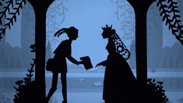
As she grey older, Reiniger became keen on working with Wegener, eventually becoming a silhouette designer for the intertitles in his films, her first being 'The Pied Piper of Hamelin' (1918). Reiniger was soon after given the task of animating rats which she enjoyed greatly, setting her future in the animation industry in motion.
Lotte Reiniger went on to create almost seventy films, including a feature-length film: 'The Adventures of Prince Achmed' (1926).
Bibliography:
Quotations-
Hutchinson, P. 2016, Lotte Reiniger, The Guardian:
https://www.theguardian.com/film/2016/jun/02/lotte-reiniger-the-pioneer-of-silhouette-animation-google-doodle
Images-
http://animationresources.org/category/lotte-reiniger/
http://www.awn.com/news/google-celebrates-lotte-reiniger-new-doodle


I altered the background buildings slightly, adding some domes so it seems like a continuous theme and tried to make some of the buildings look more intact. I also added bounce lights and rim lights to the foreground and mid-ground as you suggested but I'm not too sure how effective it is.
I think I still need to revise the building designs to make them look more stable and functional.
Originally, I thought the background was a bit dull and empty so I added a second, smaller sun and thought it would be okay seeing as Calvino doesn't outright say that these cities are on our planet from what I remember. If it needs to go, please let me know.


One-Point

Two-Point

Three-Point

Three-Point + Kicker Light
